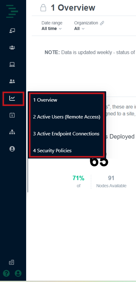
The Remote Access Portal includes preconfigured dashboards designed to help you monitor key metrics quickly and effectively. Access these dashboards from the analytics (line chart) icon in the portal’s left menu.
Dashboard Data Update Frequency
Note that dashboards are updated daily. They do not represent real-time status, but are instead designed for trend analysis.
Each dashboard includes filters to adjust by date range, building (node), user role, and protocol, and you can save and share these settings as custom views. Select a widget to open a focused report page for that data with additional filters and data export options.
Overview
The Overview dashboard provides a summary across your administrative environment, including current deployments, registered users, active endpoints, and apps and services you are running.
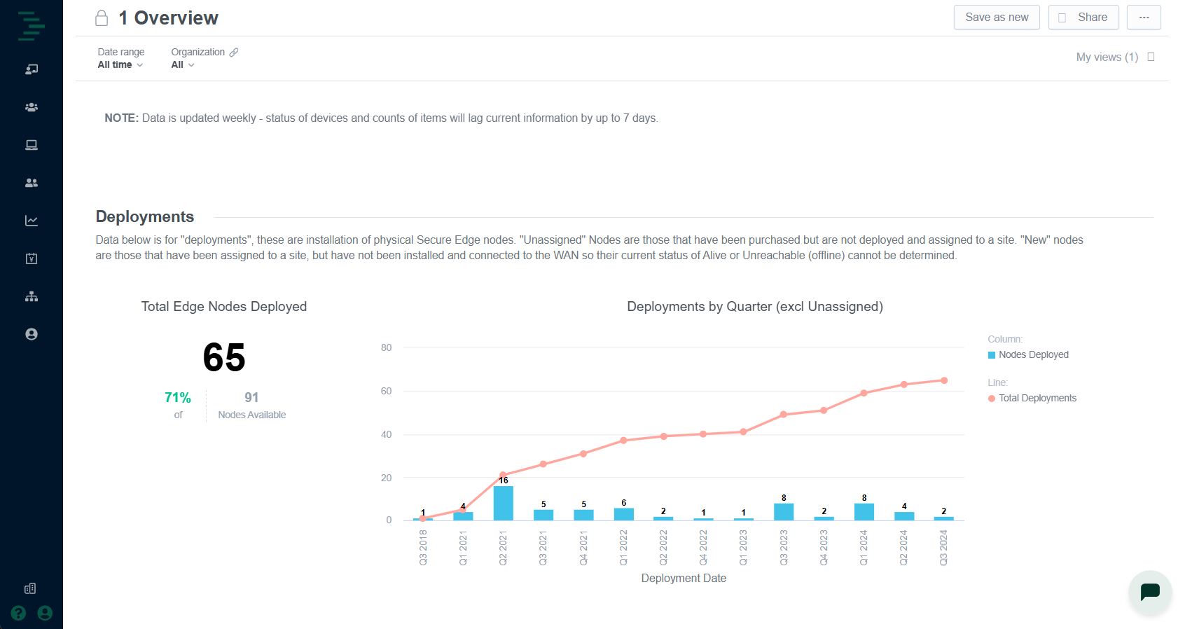
The Overview dashboard includes the following widgets:
Widget | Description | Typical Action |
|---|---|---|
Deployments | Number of Edge Nodes installed across the portfolio. | Validate rollout progress; identify sites onboarded but offline. Identify product mix. |
Registered Users | Total active user accounts within the tenant, broken down by role (Admin, Technician, Contractor). | Spot excess or dormant accounts and trigger an access review. |
Endpoints Onboarded | Devices and their connections that have been onboarded to the Remote Access portal in the selected period. | Highlight critical OT devices not reporting data. Identify endpoints onboarded but not used. |
Apps & Services | Count and percentage of containerized applications currently configured and deployed. | Detect unexpected service proliferation and health. |
Active Users
The Active Users dashboard displays usage metrics for Remote Access, including active user counts, sessions duration, and activity by building.
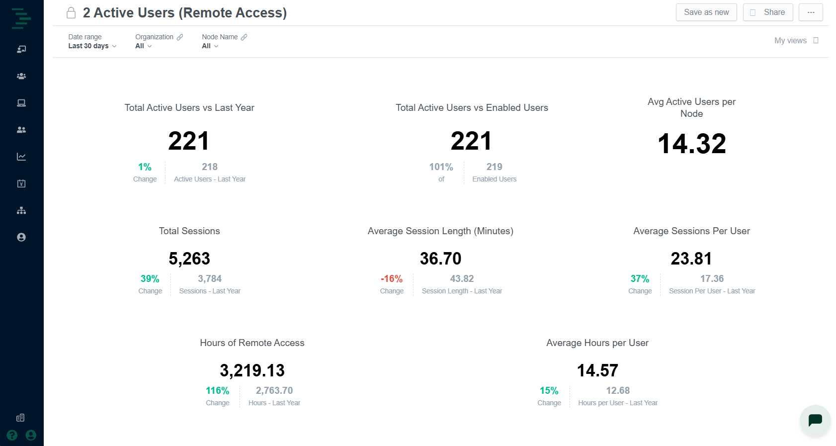
The Active Users dashboard includes the following widgets:
Widget | Description | Typical Action |
|---|---|---|
Active Users (Trend) | Line chart of daily distinct users. | Correlate technician activity with maintenance windows. |
Session Duration | Box‑and‑whisker view of log‑in lengths. | Identify unusually long sessions that may signal misuse, or unusual session activity. |
Activity by Building | Top 25 most vs. least active buildings. | Pinpoint high‑touch sites vs. those not receiving attention. |
Sessions by Country | Bubble chart world map overlay showing active users and sessions by country. | Identify user sessions originating from countries outside of building or portfolio region. |
Active Endpoint Connections
The Active Endpoint Connections dashboard shows real-time data on active connections by protocol (RDP, HTTPS, SSH, etc.) and building. It also highlights endpoints that are rarely or never used.
.png)
The Active Endpoint Connections dashboard includes the following widgets:
Widget | Description | Typical Action |
|---|---|---|
Active Endpoints | Pie chart of connection types in use, within the selected time range. | Ensure protocols align with hardening standards. |
Connections by Building | Bar chart of total current sessions per site within the selected time range. | Spot concentration of remote work by building. |
Active Endpoints by Day | Line chart showing daily total of active endpoints accessed. | Identify trends of Remote Access portal usage within the selected time range. |
Least Used Endpoints | List of devices and utilization filtered by least used to most used. | Retire or secure dormant interfaces. |
Never Used Endpoints | List of devices with connections configured for access but never used. | Retire unused device connections. |
Security Policies
The Security Policies dashboard offers visibility into your defined security rules, helping you assess how effectively they’re protecting your networks and connected devices. This includes percentage of endpoints covered, allowed vs. blocked events, and policy violations by severity.
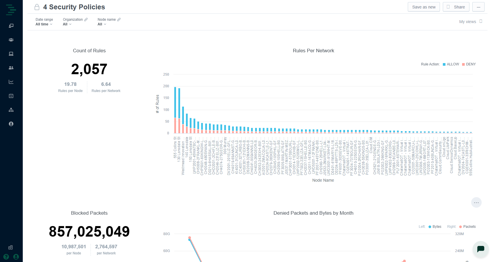
The Security Policies dashboard includes the following widgets:
Widget | Description | Typical Action |
|---|---|---|
Count of Rules | Total number of security rules configured for the selected nodes during the time range selected. | Visibility of number of rules configured per node and per OT network. |
Rules Per Network | Bar chart showing allow vs. deny rules configured per node. | Identify security policy inconsistencies configured across the portfolio. |
Denied Packets and Bytes by Month | Line chart showing total monthly denied packets and data volume over the selected time range. | Validate policy efficacy; investigate spikes in blocked traffic. |
Denied Packets by Node | Bar chart showing total number of denied packets per node during the time range selected, ranked from highest to lowest. | Prioritize incident response. Identify inconsistencies which may indicate nefarious activity targeting one or multiple nodes. |